Art Salon -- Admonitions of the Instructress to the Court Ladies
Welcome to Salon d’hiver where various artpieces are presented through the screen. I will lead you into a world of pure vision, bringing out your utmost visual and analytical capability. Pure Looking deals with what art historians call “formal analysis”: observing the most basic visual qualities of an image without any inference to its representational meaning.
Please follow this link to get a complete and detailed look at the piece.
Pure Looking
First viewing the digital copy of this masterpiece on the British Museum’s archive, I was shocked by its richness in content and the diversity of form. The handscroll is very long, the length to width ratio roughly over 32 to 1. Following Chinese handscroll’s traditional viewing sequence, the viewer would come across two patches of embroidery, a calligraphy piece, a series of comic-strip like paintings, a painting of orchid, followed by two more calligraphy pieces, and a landscape painting.
Not two consecutive pieces are of the same style, yet they all share high artistry. The rightmost embroidery is a highly decorative ensemble of intricate patterns. It separates into two segments. On one side, the patterns combine abstract geometric representation with life-like flowers, both highly detailed and organized in a highly symmetrical way. On the other, the curvature of the PEONY flowers and leaves gives a sense of realism.
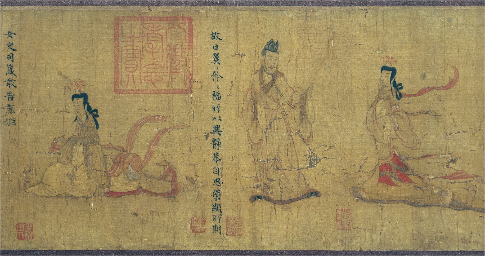
Unlike the decorative nature of the embroidery, the painting in the middle is all about storytelling. There are seven scenes in all, six devoted to figure painting, one to landscape, each accompanied by several calligraphy lines on its right. The painter fully utilized shape and color to bring its character to life. Each figure is depicted with great detail, as one could see the various facial expressions and movement in each scene. The dynamic figures in the scene all bear elegant curvature on its contour that exhibits a lofty and mobile sense of feeling. The painter also uses different shades of red and black to add an organic touch to what could have just been a monochromatic piece.
The orchid painting is composed of minimal ink brush strokes, exhibiting a high level of simplicity. In comparison, the landscape painting on the far left is more detailed in depicting pine tree leaves and branches. It also makes full use of the negative space that leaves the viewers to imagine the horizon and beyond.
The three pieces of calligraphy have distinct styles and sizes. The leftmost piece and the middle piece clear juxtapose with each other in terms of character style. The middle one is thinner, flatter while the left one is the largest and only has three characters. Yet, one could observe that all three calligraphy works are highly organized, characters aligned and neatly done.
Upon first viewing, all these works seem to be a potpourri. The question comes naturally that why are all these works ensembled to the same panel? How are they related to and interact with each other? Does the sequence tell a specific story?
Another feature that stood out in this works is the seals of different sizes, fonts, and shapes that occupy all over the background of paintings and calligraphy pieces. One could also notice that seals are most present in two sections, the transitional area between the orchid painting and the left of Gu’s work, as well as the space between the calligraphy and Gu’s work. There are also repeated appearances of the same seal imprinted on Gu’s work as many as five times. One could observe that seals are mostly avoiding the subject matter whether it is figures or calligraphy characters.
What do these seals stand for? What does their spatial occupation do to the work? These are all intricate questions to be uncovered.